Being a journalist today is tough. Many people are exhausted by negative news and are actively avoiding it. Others have simply stopped trusting journalists altogether. The old ways of telling stories can seem limiting and it can be hard to capture the attention of audiences who have the entire Internet to choose from. But in that sea of information, the truth still matters.
Gapminder wants to make it easy to spread facts and give context to breaking news. Our free-to-use tools enable journalists to test their audience’s knowledge, see how data on important global trends has changed over time, and see inside the homes of people on different incomes across the world.
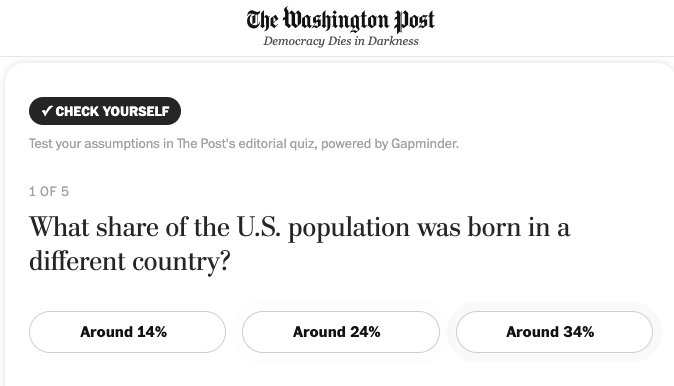
We have been developing an Unknown Story Service for journalists alongside the Washington Post that proves constructive journalism can be concrete rather than merely conceptual. Read more about that work here.
We also have three main tools that journalists may find useful in their work:
All our content is freely available to use under the Creative Commons Attribution 4.0 International license. All you need to do is credit us in the following way: “Free material from www.gapminder.org”.
Test your audience!
We have asked the public thousands of questions about important global facts on things like health, poverty and climate change, and they are completely wrong about a lot of important things!
The Worldview Upgrader is a collection of the biggest misconceptions people have across all of the UN’s Sustainable Development Goals. It helps people to recognize what they are wrong about and put them on the path to a more fact-based worldview.
These questions and the explanations we use are free for journalists to use on their websites or social media. All of the questions and sources have been fact-checked with at least two independent experts.
Here is a guide for journalists and media organizations on how to use the Worldview Upgrader.
Look at the trends!
Bubble charts, income mountains and other data visualizations
Most people first discovered Gapminder through Hans Rosling’s Ted Talks when he presented data in a way that no-one had ever seen before. Those bubble charts now cover hundreds of measures, from life expectancy through to CO2 emissions per person. They are updated when new data becomes available and are free for journalists and news organizations to use.
There is a “How To Use” video above the charts here.
That guide explains how it is possible to track the progress of individual countries or compare with others and see changes over time using the slider on the bottom.
Charts can be shared directly onto social media or embedded in articles or web pages using the buttons on the top right of the screen (the language can also be changed to Arabic or Russian).
Our income mountains, rankings and trend charts can be shared the same way.
See the reality behind the data
You can view, download and reuse photos from inside the homes of hundreds of people in more than 50 countries. The ‘street’ is organized by income and makes it possible to compare the everyday items and living conditions of people in different countries in a way you can’t anywhere else. For example, here are the stoves of people in different countries who all have a high income. Not much difference between them is there?
You can find out more about how to use Dollar Street by simply clicking on “Quick Guide” in the menu.
Data sources
All of our data comes from one of the three following sources:
- Reliable, well established data providers (such as the UN, World Bank and WHO)
- Peer-reviewed journal articles that we have fact-checked with independent experts
- Our own calculations, which we write about in detail in the source notes for each question or visualization.
More questions?
If you have any more questions, see if we already have it covered in our FAQs. If we haven’t, please message us on [email protected] and we will get back to you as soon as we can.