Documentation — version 31
Data » Online spreadsheet with data for countries, regions and global total — v31 (PPP$2017)
Data » Online spreadsheet with data for countries, regions and global total — v31 (PPP$2021)
SUMMARY DOCUMENTATION OF V31
Sources
GDP per capita measures the value of everything produced in a country during a year, divided by the number of people. The unit is constant dollars adjusted for inflation in 2017’s prices. As the cost of living varies across countries, we use a currency called “international dollars”, which is adjusted for Purchasing Power Parity(PPP). This is a virtual currency that enables better comparisons. Such a dollar would buy in each country a comparable amount of goods and services as a U.S. dollar would buy in the United States. GDP per capita is the GDP divided by the population of the country, which gives a rough estimate of the average annual income of the citizens.
Sources:
Gapminder’s long GDP per capita series covers the period from 1800 up to the present year. These long series are produced by combining multiple different data sources.
Period 1990 to 2022: In more recent years, between 1990 and 2022, our series are identical to the GDP per capita data from the World Bank, published in April 2024 in their World Development Indicators. Before the World Bank series starts in 1990, we have used the following sources:
Period 1820 to 1990: The Maddison Project Database is based on Maddison’s original dataset with rough estimates of historical GDP per capita for most countries, maintained and improved by the Groningen Growth and Development Centre. We used the data in their 2023 version which provides information on comparative economic growth and income levels over a very long period. The 2023 version covers 169 countries and the period up to 2022. We use these numbers up to the first year with data from the World Bank (for most countries it’s usually 1990). When the two series are not matching, we bridge between the two series over a long period of decades to avoid introducing an artificial jump in the trend when shifting sources.
Period 1950 to 2019: In a few cases where neither World Bank nor Maddison have data, we fall back on estimates from the Penn World Table. We use data from the version PWT version 10.01 of the Groningen Growth and Development Centre, which is a platform for research on economic growth and development, covering 183 countries between 1950 and 2019. When shifting between sources we smooth the transition to avoid artificial trend-jumps.
Gapminder’s additional estimates: Whenever the above sources are missing we rely on the historic estimates we made in a previous version of this indicator: Gapminder GDP Per Capita v26. Most of these historic estimates haven’t been revised since they were produced and documented by Mattias Lindgren in version 14 in 2011: GM-GDP per Capita v14. In additional to these older estimates by Gapminder, we have produced some new estimates for countries that are currently undergoing crisis, like Afghanistan, Belarus, Burundi, Cuba, Guyana, Lebanon, Liechtenstein, Moldova, Monaco, North Korea, Russia, Syria, Ukraine, Venezuela, and Yemen.
How were the sources combined?
We first updated our historical estimates based on the new data released by the Maddison Project Database (MPD) and Penn World Table (PWT). We used MPD data wherever data is available. Otherwise, we used PWT estimates.
In general, we connected Gapminder historical data in version 26 to MPD/ PWT data and adjusted the data based on the earliest available year with data in MPD or PWT. We made an exception for countries with MPD data available for the year 1820 or earlier, where we then used MPD data without any adjustment.
The Historic data generated is the above step using Gapminder Historic data v26, MPD and PWT can’t be combined to the latest data of GDP per Cap of World Bank and IMF, since the numbers are expressed in the International Purchasing Power Parity (PPP$) dollars of 2017, while the historic data is based on an earlier version of PPP$ namely 2011. In order to smoothly combine the two datasets, we used a simple way to calculate a Ratio based on the GDP per Cap from the Historic data and World Bank data for the year 1990. Using that ratio, we shifted the Historic data from PPP 2011 to PPP 2017 for all countries.
After we connected the historical estimates to World Bank data by smoothly transitioning our historic trend over a period of 70 years (1940-2010) to reach World Bank data.
Why blending?
The reason for this blending is to avoid artificial staircases in the middle of the series, when shifting from one modern source to historic sources. Such sudden movements would falsely appear as sudden changes in countries economy, but actually be artifacts produced as a side-effect of shifting data sources.
In the figure below,
- HIST: The solid red line — is Historic data mainly based on Madisson and additions from Gapminder v26, expressed in $PPP 2011.
- HIST_SHIFTED: The dashed brown line – – – is the historic data shifted to PPP 2017.
- MOD_MAIN: The solid blue line — is Modern data from World Bank and IMF.
- MOD_REW: The dashed blue line – – – is Modern data “rewinded” backwards based on annual growth rates in the Historic data from point b, back to 1800.
- BLENDED: The solid pink line is the output. It is “blended” between the historic and the modern sources, starting from point a in the shifted historic trend, blending over 70 years to point b, incrementally blending in more and more of the data from MOD_REW. This means that we are constructing a trend that is moving slowly from the Historic data (adjusted to PPP 2017) to Modern data from World Bank and IMF.
The pink line below roughly illustrate how we blend the series:
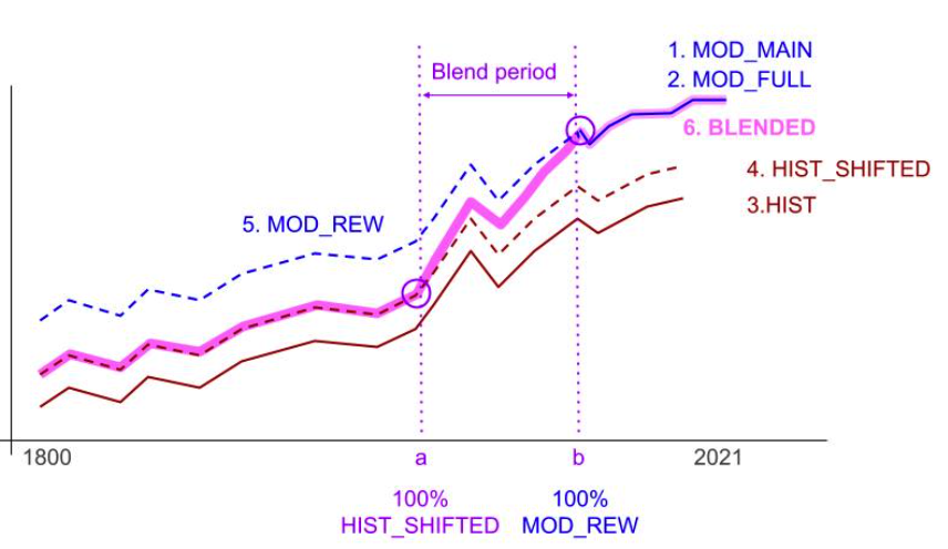
That describes the principle followed for most countries, but then we made exceptions in 31 cases where we preferred the following adjustments: (i) to use Gapminder’s series instead of MPD for the period 1800 to the start of WB data as the MPD data were mostly interpolated series and this makes events in single years not showing up as dips or peaks in single years. (ii) To move smoothly between GM/PWT and MPD in case the discrepancy between the estimates in the sources was large or (iii) To use MPD/PWT series instead of WB for some years.
An “if-scenario” for future growth
In the dataset we have extended the series up to 2100, but this doesn’t mean we think we know how the future will unfold. We have just calculated a hypothetical scenario for future GDP per capita growth for each country, to illustrate how “countries’ GDP per capita would continue to grow IF current trends continue”. We call this a IF-scenario, which is useful to answer the question what will the world economy look like IF everything continues like in the past. For this we use two methods of calculations for the short term future: up to 2030 based on forecasts from two other sources. After 2030 we extend the trends by applying annual growth rates for each country, assuming middle income countries grow faster than low and high income countries, like they have in the past 30 years. See below for more details.
Scenario for period 2023 – 2029: In this, we use values for annual growth rates for all countries from 2023 to 2029, primarily from IMF, in their World Economic Outlook 2024, April edition. Then, onwards from 2029-2030 we forecast future GDP per cap using the growth rate provided by Atlas of Economic Complexity (AEC) up to 2030. We assume that RECENT measured growths and the AEC are better predictors of the future than the IMF forecasts.
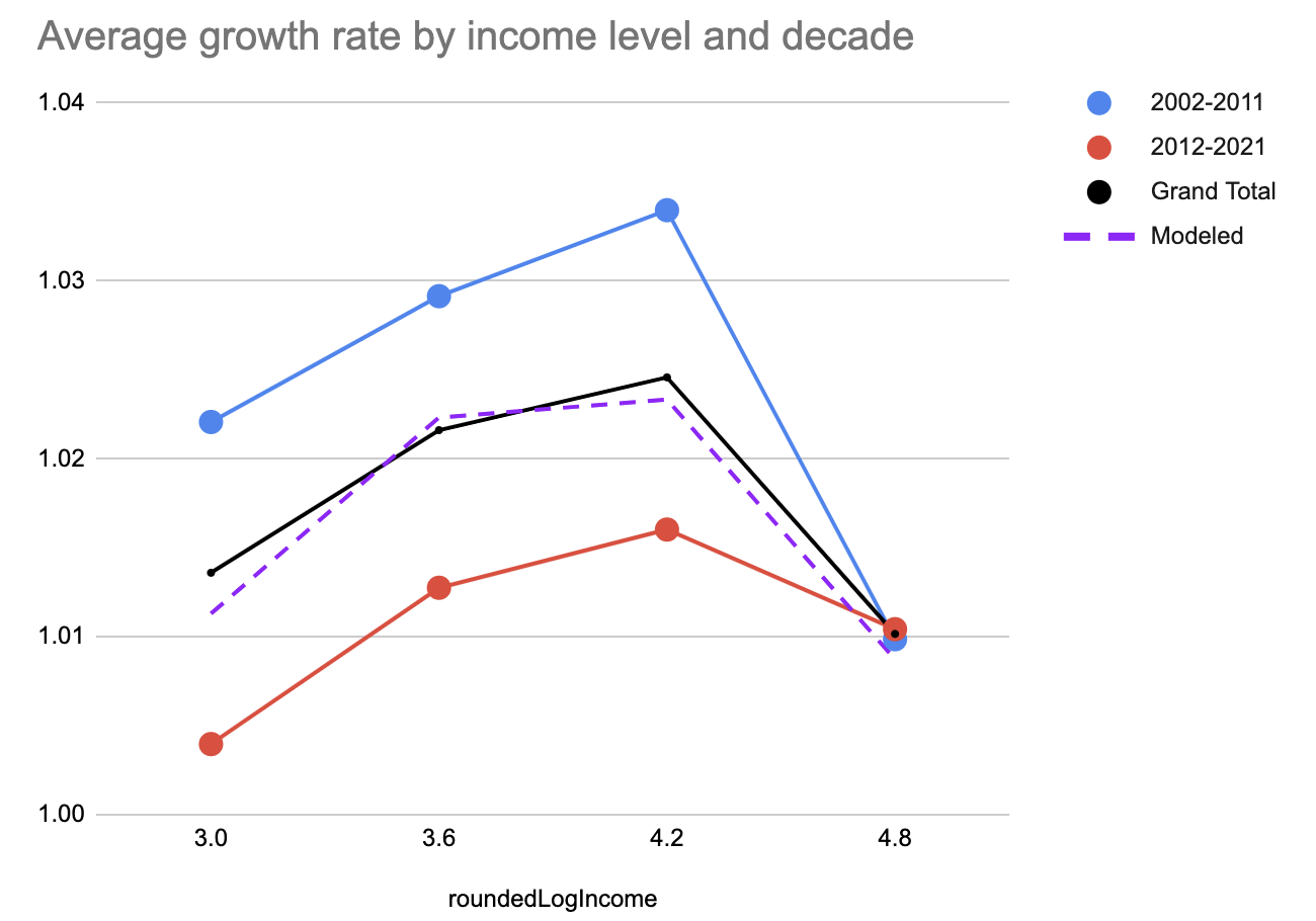
Scenario beyond 2030: From 2030 onward to 2100, we use a model for Annual growth based on the assumption that faster growth will continue in countries that are in the middle income level, and as they get richer and richer, their growth rates slow down, and finally when countries get rich like Qatar, their annual growth stops.
This assumption is based on the observed growth rates during the past 30 years, where income growths seem to decline with higher income.
The graph below shows the log(GDPperCap) on X vs. Annual Growth for all countries. Each dot is an average of a period, and every country has two dots, one for 2001-2007, and one dot for 2010-2019. Most of the really high growths are in the middle income, and most countries with High or Low income, had slow growths.
The model combines to polynomial functions of order 3, looking like this:
y = a*x3 +b*x2 +c*x +d
The first function is the best fit third order polynomial of 400 data points, representing the average income and growth rate of each country over the two ten year periods. The functions were generated in this Excel file.
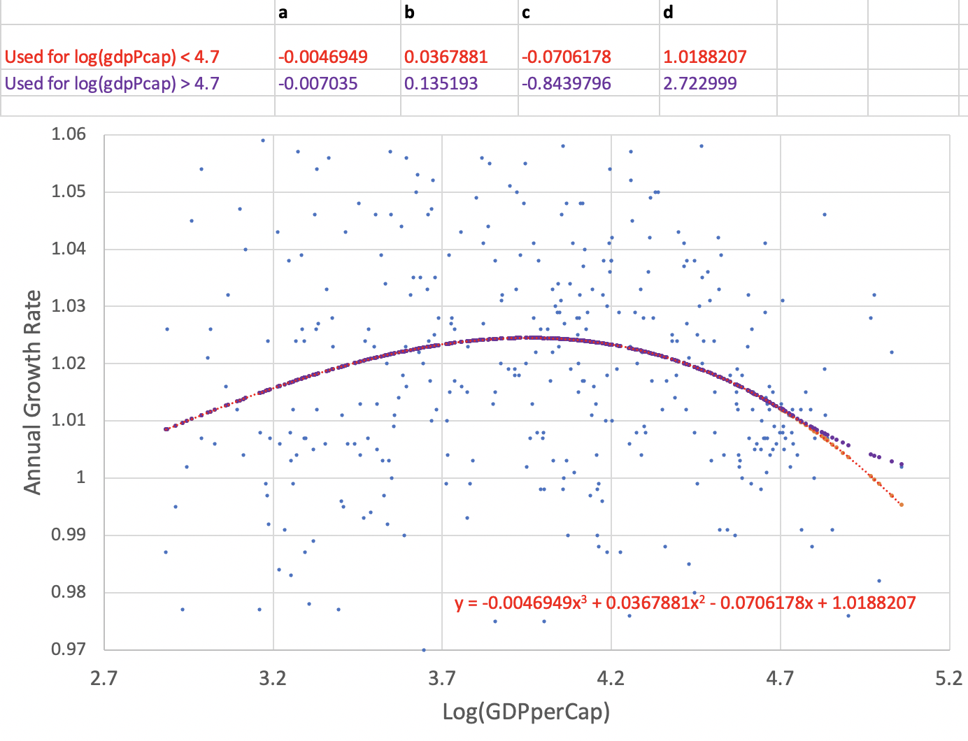
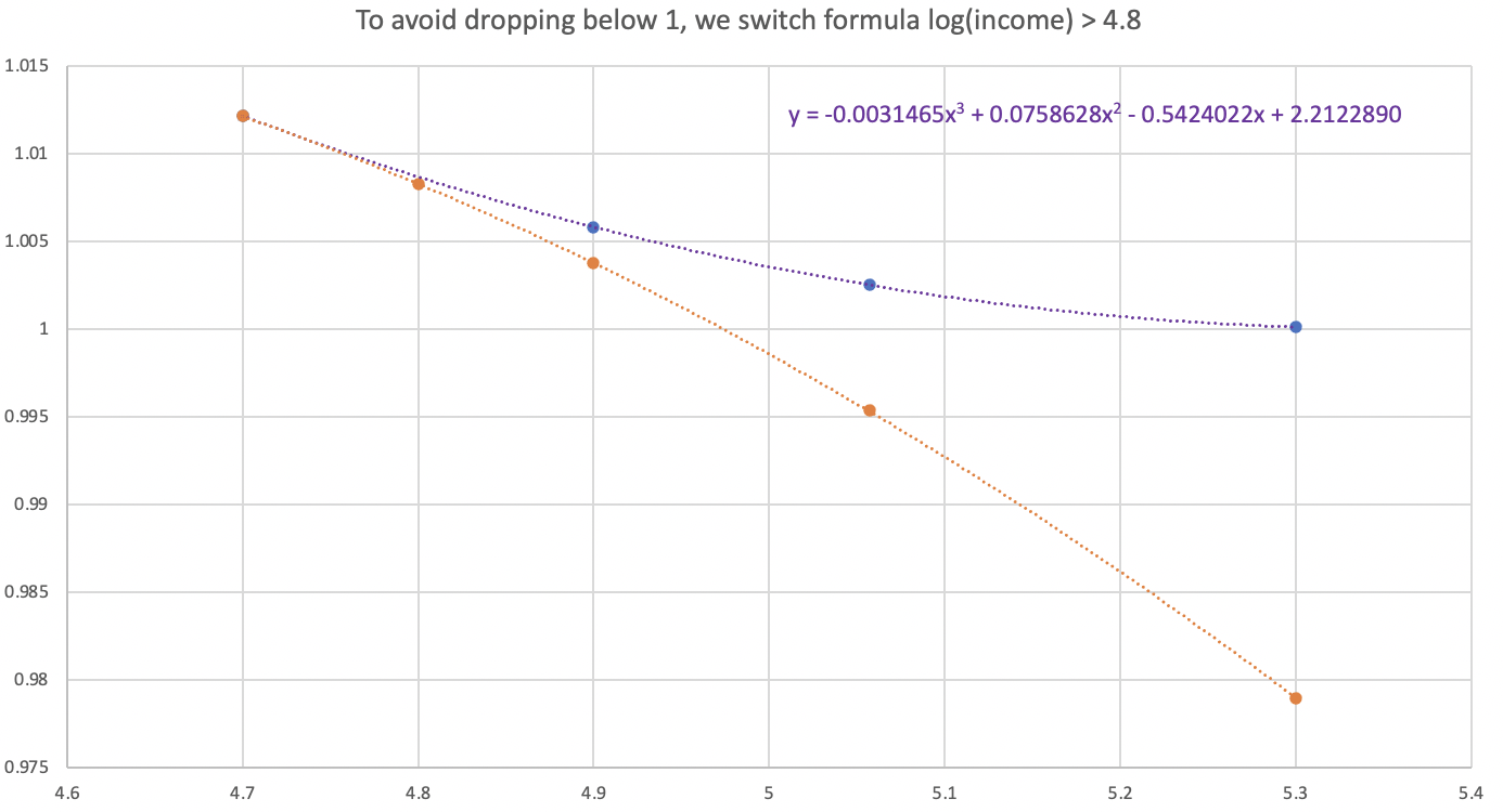
The second function is only to protect against negative growth rates above log GDPpc of 4.7, as seen to the right bottom corner of this graph.
Previous versions
V30
Data » Online spreadsheet with data for countries, regions and global total — v30
Documentation » GDP per Capita v30 Documentation
V29
Data » Online spreadsheet with data for countries, regions and global total — v29
Documentation » GDP per Capita v29 Documentation
Summary documentation of v28
Data » Online spreadsheet with data for countries, regions and global total — v28
Sources
GDP per capita measures the value of everything produced in a country during a year, divided by the number of people. The unit is in international dollars, fixed to 2017 prices. The data is adjusted for inflation and differences in the cost of living between countries, known as PPP dollars.
In more recent years, between 1990 and 2019, we use the GDP per capita data from the World Bank, published in May 2022 in their World Development Indicators. Before the World Bank series starts in 1990, we have used several sources:
Maddison Project Database: The Maddison Project was started in March 2010 by a group of Angus Maddison’s close colleagues, with the aim of supporting an effective cooperation between scholars to continue Maddison’s work on measuring economic performance for different regions, time periods and subtopics. The MPD built on Maddison’s original dataset. The original estimates are kept intact, and only revised or adjusted when there is more and better information available. Currently, the database is maintained and improved by the Groningen Growth and Development Centre.We have used the data in their 2020 version which provides information on comparative economic growth and income levels over a very long period. The 2020 version covers 169 countries and the period up to 2018.
Penn World Table: We use data from the Penn World Table version 10.0 of the Groningen Growth and Development Centre, which is a platform for research on economic growth and development. PWT version 10.0 is a database with information on relative levels of income, output, input, and productivity, covering 13 countries between 1950 and 2019.
Gapminder v27: This is the previous version of GDP per capita published by Gapminder, and which was based on World Bank, IMF, and historical time series from the Maddison Database Project 2018 version, PWT 9.1 and GM-GDP per Capita v14 (documented and detailed based on multiple sources but mostly based on Agnus Maddison). For more details on previous versions, see the documentations below. We use GM-GDP per Capita v27 for the historical time series which are not available in the Maddison Project database or Penn World Table.
How were the sources combined?
We first updated our historical estimates based on the new data released by the Maddison Project Database (MPD) and Penn World Table (PWT). We used MPD data wherever data is available. Otherwise, we used PWT estimates.
In general, we connected Gapminder historical data in version 27 to MPD/ PWT data and adjusted the data based on the earliest available year with data in MPD or PWT. We made an exception for countries with MPD data available for the year 1820 or earlier, where we then used MPD data without any adjustment.
After, we connected the historical estimates to World Bank data by smoothly transitioning our historic trend over a period of 30 years to reach World Bank data for the first year it is available.
That describes the principle followed for most countries, but then we made exceptions in 31 cases where we preferred the following adjustments: (i) to use Gapminder’s series instead of MPD for the period 1800 to the start of WB data as the MPD data were mostly interpolated series and this makes events in single years not showing up as dips or peaks in single years. (ii) To move smoothly between GM/PWT and MPD in case the discrepancy between the estimates in the sources was large or (iii) To use MPD/PWT series instead of WB for some years.
Our data continues into the future up to 2027, based on forecasts from the IMF, in their World Economic Outlook 2022, April edition. We have applied the IMF expected changes rates on WB estimates. Beyond that point we have extended the series up to 2050. Economic forecasts are never very reliable, and we do these projections only to visualize an “if-then-scenario”. If the current trends for each country continued up to 2027, and if all countries at the end of the IMF’s forecast will converge to a common global (and modest) growth rate of 2% per year, then what would the world look like? Answering this question visually helps us show how much richer the world would become even with a modest growth rate. We’re not claiming that this is what will happen.
Summary documentation of v27
Sources
Data » Online spreadsheet with data for countries, regions and global total — v27
GDP per capita measures the value of everything produced in a country during a year, divided by the number of people. The unit is in international dollars, fixed to 2017 prices. The data is adjusted for inflation and differences in the cost of living between countries, known as PPP dollars.
In more recent years, between 1990 and 2019, we use the GDP per capita data from the World Bank, published in March 2021 in their World Development Indicators. Before the World Bank series starts in 1990, we have used several sources:
Maddison Project Database: The Maddison Project was started in March 2010 by a group of Angus Maddison’s close colleagues, with the aim of supporting an effective cooperation between scholars to continue Maddison’s work on measuring economic performance for different regions, time periods and subtopics. The MPD built on Maddison’s original dataset. The original estimates are kept intact, and only revised or adjusted when there is more and better information available. Currently, the database is maintained and improved by the Groningen Growth and Development Centre.We have used the data in their 2020 version which provides information on comparative economic growth and income levels over a very long period. The 2020 version covers 169 countries and the period up to 2018.
Penn World Table: We use data from the Penn World Table version 10.0 of the Groningen Growth and Development Centre, which is a platform for research on economic growth and development. PWT version 10.0 is a database with information on relative levels of income, output, input, and productivity, covering 13 countries between 1950 and 2019.
Gapminder v26: This is the previous version of GDP per capita published by Gapminder, and which was based on World Bank, IMF, and historical time series from the Maddison Database Project 2018 version, PWT 9.1 and GM-GDP per Capita v14 (documented and detailed based on multiple sources but mostly based on Agnus Maddison). For more details on previous versions, see the documentations below. We use GM-GDP per Capita v26 for the historical time series which are not available in the Maddison Project database or Penn World Table.
How were the sources combined?
We first updated our historical estimates based on the new data released by the Maddison Project Database (MPD) and Penn World Table (PWT). We used MPD data wherever data is available. Otherwise, we used PWT estimates.
In general, we connected Gapminder historical data in version 26 to MPD/ PWT data and adjusted the data based on the earliest available year with data in MPD or PWT. We made an exception for countries with MPD data available for the year 1820 or earlier, where we then used MPD data without any adjustment.
After, we connected the historical estimates to World Bank data by smoothly transitioning our historic trend over a period of 30 years to reach World Bank data for the first year it is available.
That describes the principle followed for most countries, but then we made exceptions in 31 cases where we preferred the following adjustments: (i) to use Gapminder’s series instead of MPD for the period 1800 to the start of WB data as the MPD data were mostly interpolated series and this makes events in single years not showing up as dips or peaks in single years. (ii) To move smoothly between GM/PWT and MPD in case the discrepancy between the estimates in the sources was large or (iii) To use MPD/PWT series instead of WB for some years.
Our data continues into the future up to 2026, based on forecasts from the IMF, in their World Economic Outlook 2021, April edition. We have applied the IMF expected changes rates on WB estimates. Beyond that point we have extended the series up to 2050. Economic forecasts are never very reliable, and we do these projections only to visualize an “if-then-scenario”. If the current trends for each country continued up to 2026, and if all countries at the end of the IMF’s forecast will converge to a common global (and modest) growth rate of 2% per year, then what would the world look like? Answering this question visually helps us show how much richer the world would become even with a modest growth rate. We’re not claiming that this is what will happen.
In some cases, the new estimates and forecasts made countries much richer than previous releases. This means that many countries moved their position in our bubble charts as the updated data changed drastically. For more details about the changes between versions, see a detailed data file for v27 here.
Detailed documentation and feedback
For transparency, we provide the files that we used to calculate this data, which can be found here. Any questions about the data and suggestions for how to improve it are always very welcome in our data forum.
(For several years we were too busy with other things, and failed to update this documentation. Many versions are simply missing from the list below, but those updates were quite trivial: We just kept updating the end of our long historic trends, with the latest numbers from the World Bank every time they released new data.)
v26
» Excel-file with data & meta-data – v26
» Documentation_ GDP per Capita v26
v25
» Excel-file with data & meta-data – v25
v14
» Excel-file with data & meta-data – v14
» Documentation – (pdf)
v13
» Excel-file with data & meta-data – v13
v12
» Excel-file with data & meta-data – v12
v11
» Excel-file with data & meta-data – v11
v9
» What was new in version 9 (word)
v8
» Documentation of version 8 (pdf)
» Excel file with data and summary meta-data of version 8 (xlsx)
» Go to the google spreadsheet that contains the “data quality rates” for the indicator (spreadsheet)
v3
» Download documentation of version 3 (pdf) – Version 3 is the version of the indicator before the major revision in 22 december 2008. The indicator is available in the graph, it is called “old version of income per person”