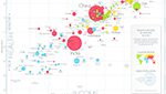
This chart compares Life Expectancy & GDP per capita of 182 nations in the year 2013. Each bubble is a country. Size is population. Color is region. People live longer in countries with a higher GDP per capita. No high income countries have really short life expectancy, and no low income countries have very long life … Continue reading Gapminder World Poster 2013